Ohio State University 2016 Draft Wall
As part of an interview, I was invited to create a design for the Ohio State University that would introduce the most recent NFL draft picks from OSU.
Client: Ohio State University
Problem: A 20’ x 10’ wall that requires a display that communicates “Ohio State Buckeyes in the NFL”, and communicates the most recent NFL draft picks
Solution: Create a display that is impactful and creative that communicates well to the client. and re-enforces the Ohio State Brand.
Here is a loose review of the process I took in this exercise.
Start researching
- Look up OSU’s color and brand guidelines at https://brand.osu.edu/
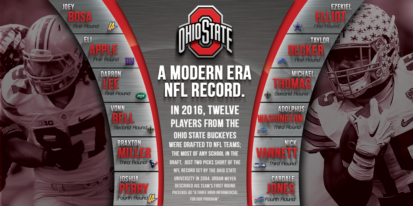
- See what happened in the 2016 draft for OSU – It turns out this was a killer year for OSU – they had 12 students drafted; more than any other team
- Pull the students’ data – names, info, etc
- Gather some quotes – there were a few really good quotes from Urban Meyer and some journalists that I could use to help put emphasis on the significance of this year’s draft.
Brainstorm
- I decided to focus on the significance of this year’s draft for OSU – being the top drafted school and having 12 draft choices in the first four rounds was a “modern-era NFL record” – that’s huge. There’s a story that can be told here, which provokes a lot more interest that displaying only the players.
- I’m a big fan of signage – both graphical and dimensional. I often produce dimensional signage on my CNC router and was able to visualize how all the elements could work together in my head. Given that there are no restrictions in this project, assumed I could use multi-layered elements, that electricity is available, and that budget isn’t a problem.
Get to sketching
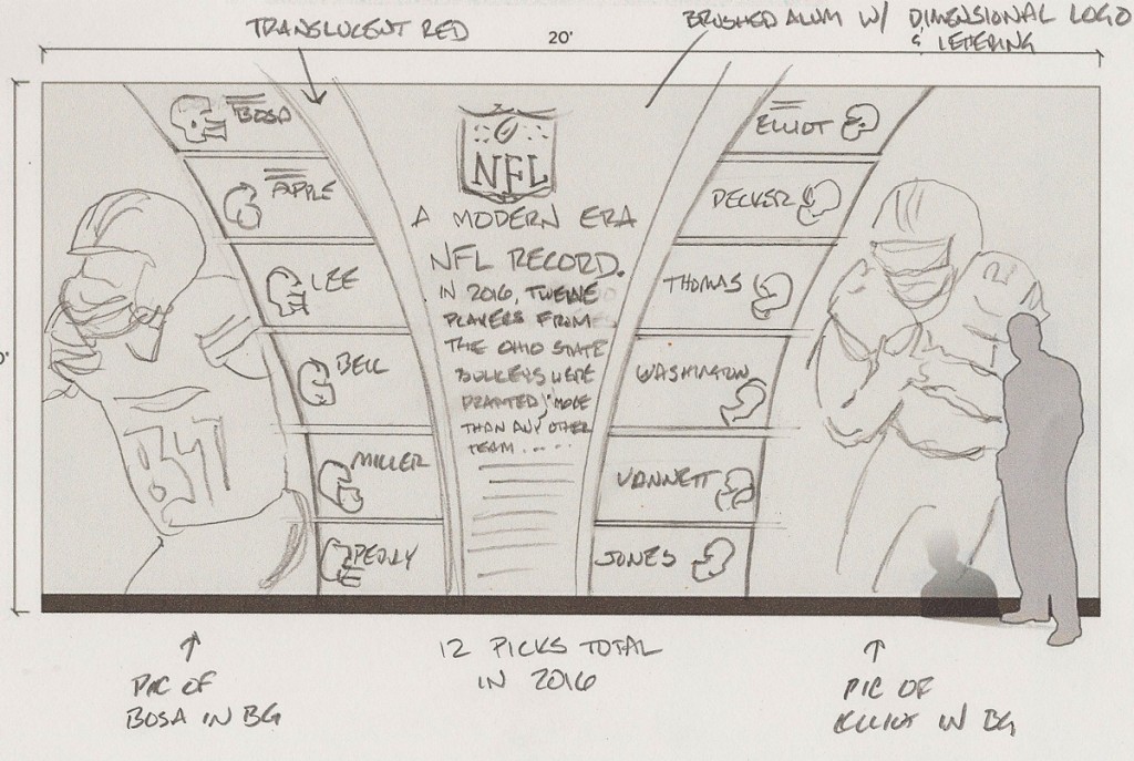
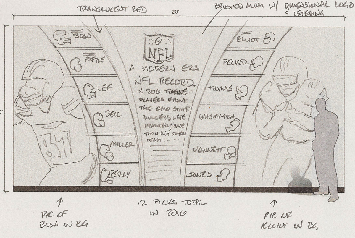
- Sketch “A” is very symmetrical. In the background, I fill the space with duotone pics of the top two draft picks from OSU, using the OSU brand colors. Over top of the base wall, independent panels reside with the players names, and other pertinent info. In front of the player panels are translucent red panels which would be backlit, giving separation between the center panel and player panels. Finally, a center panel would overlay the translucent red panels, and would be made of brushed aluminum. The logo would be dimensional, as would the top two lines of text (A MODERN ERA NFL RECORD). The text below would probably just be vinyl or printed. The text would get smaller as it progresses. Starting with larger copy at the top and gradually transitioning to smaller copy draws the eye in and persuades the user to keep reading. Aside from the backlighting, directional lighting would be used from above to add dimension to all the dimensional aspects of the wall – the logo, names, copy, etc. Shadows produced by the overhead lighting would make it pop and add interest.
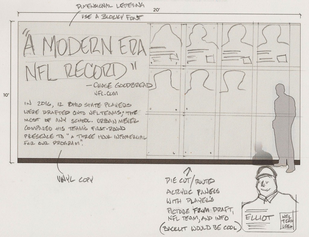
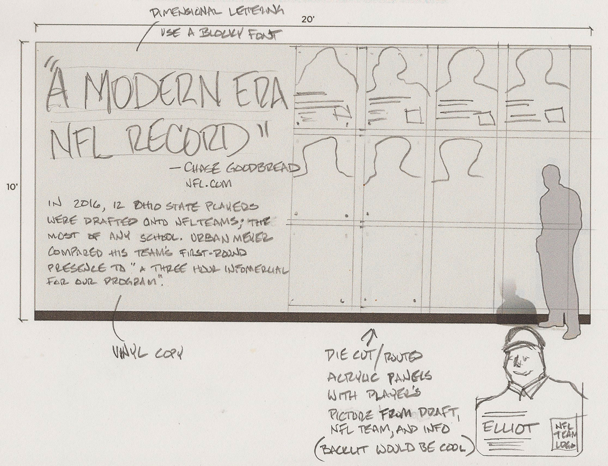
- Sketch “B” would have had more emphasis on the hero and body copy. The hero copy would be dimensional, and the body copy printed or cut form vinyl on the wall itself. Each of the 14 players drafted would have an independent, die cut panel with a headshot and pertinent info. When I researched assets for this, I found that only the first round players had good head shots available. That kind of killed my layout idea. This could still be made to work using action photos of the players instead of head shots, and I believe it could be made to work out, but decided not to move forward mocking up in Photoshop.
Mock it up in Illustrator/Photoshop
From this point, I took the sketch and reproduced it in Photoshop, adding color, shadows and effects to give a realistic view of the finished product. While I’m happy with the design, I think it would be amazing in real life. The various dimensional elements would work well with different light sources to create a very compelling display.